Before the Logo: Ten Afternoon Checks That Save UK Small Firms a Redesign Bill

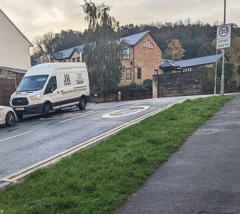
Photo: JoachimKohler-HB, CC BY-SA 4.0, via Wikimedia Commons
A new logo is the most requested fix in small business branding. It is also often the most expensive way to solve the wrong problem. If your website uses one typeface, your van uses another, your invoices look like they came from a different company and your social photos are a mix of dark phone snaps and stock handshakes, a new logo will not tidy any of that up. It will just join the mess.
Before you pay for a redesign, set aside an afternoon and a £50 budget. The audit itself is free. The £50 is for printing a few real touchpoints in colour, a notebook, and a coffee while you lay everything out on a table. In 2026, that is still cheaper than a logo project you did not need.
Why a cheap audit comes before a redesign
A brand audit is not a critique of your taste. It is a consistency check. You are looking at what customers actually see, not what is in your head. A redesign can give you a lovely new asset, but if the underlying identity is patchy, the new asset will feel disconnected within a month.
The aim here is to separate three things: what needs fixing, what needs a refresh, and what should be left alone. That last category matters. Plenty of businesses rebrand out of boredom and lose recognition in the process.
What you need
- Your laptop or phone, with your website, social profiles and Google Business Profile open.
- A printed copy of your homepage, an invoice, a quote, a business card and a photo of your shopfront or van.
- Screenshots of two recent social posts.
- A notebook and pen.
- Up to £50 for colour printing, parking and a coffee. No design software required.
Give yourself two hours. One hour for gathering, one hour for scoring.
The ten checks
1. The three-second website test
Open your homepage on your phone. Hand it to someone who does not know your business. Can they say what you do, who it is for, where you are and what to do next within three seconds? Score 0 if the first screen says 'welcome' and nothing else. Score 1 if they get some of it. Score 2 if they get all of it without scrolling.
2. Logo file sanity
Do you have a proper vector file, such as SVG, EPS or PDF? Do you have a version that works on dark and light backgrounds? Is the logo stretched, pixelated or crammed into a square? Score 0 if you only have a JPEG from 2014. Score 1 if you have a decent PNG but no vector. Score 2 if the files are tidy and usable.
3. Font count
Count the typefaces used across your website, social posts, invoices and signage. Two is usually plenty. More than three is a warning sign. Score 0 if every post looks like a different business. Score 1 if there is a rough family resemblance. Score 2 if the same fonts keep turning up.
4. Colour consistency
Do your colours match across print and screen? Is there a primary colour and a neutral, or does every post use a new shade of teal? Use a free eyedropper tool if you are unsure. Score 0 if the colours clash. Score 1 if they are close but inconsistent. Score 2 if they look like they belong together.
5. Photo quality
Are your photos bright, in focus and roughly consistent in style? Or are they a mix of dark kitchen-table shots, blurry event photos and generic stock images of people pointing at laptops? Score 0 if customers would struggle to see the product. Score 1 if some are good and some are not. Score 2 if the photos feel like the same business.
6. Shopfront, signage or vehicle
Does the physical side of your business match the digital side? Is the name clear? Are the opening hours visible? If your van is your main advert, does it look intentional? Score 0 if a customer would not recognise you from the website. Score 1 if the name matches but the style does not. Score 2 if it feels joined up.
7. Invoice, quote and email signature
Do your paperwork and emails look like they come from the same firm as your website? Is the logo the right version? Are the contact details current? Score 0 if the invoice looks like a different company. Score 1 if it is plain but tidy. Score 2 if it is consistent and easy to read.
8. Social profile grid
Look at your profile photo, bio, link and last nine posts. Does the bio say what you do and where? Does the profile image match your logo? Does the grid look like one business? Score 0 if the bio is blank or confusing. Score 1 if it is partly there. Score 2 if a stranger could work out what you offer.
9. Google Business Profile
For many UK small firms, this is the real homepage. Check the name, category, opening hours, photos and reviews. Is the information correct? Are there recent photos? Score 0 if it is unclaimed or out of date. Score 1 if it is claimed but thin. Score 2 if it is accurate and active.
10. The two-place test
Pick two customer touchpoints, such as your van and your invoice, or your shopfront and your Instagram. Would a customer know they belong to the same business? Score 0 if they look unrelated. Score 1 if there is a clue. Score 2 if the connection is obvious.
The scoring sheet
Add up your ten scores. Each check is worth 0, 1 or 2, so the total is out of 20.
- 0 to 7: foundation problem. Do not commission a new logo yet. Fix the cheapest consistency issues first.
- 8 to 14: patchy identity. Pick the three lowest scores that appear in your actual customer journey. Fix those before anything cosmetic.
- 15 to 20: leave the identity alone. Your issue is more likely messaging, offer or visibility. A redesign would be a distraction.
What to fix, refresh or replace
A low score does not automatically mean 'new brand'. If your logo files are messy but the logo is recognisable, get the files redrawn, not the identity replaced. If your fonts are inconsistent, write a one-page rule and stick to it. If your photos are muddy, book a half-day shoot. If your signage is confusing, get a new sign, not a new logo. If your invoices are mismatched, make a template.
Replace the logo only if it fails at small sizes, cannot be reproduced properly, or no longer matches what you actually sell. Even then, bring the audit with you. A designer will thank you for it, and you will spend less time explaining what is wrong.
What to leave alone
If customers recognise you, do not change things for novelty. If a low score is on a channel you do not use, ignore it for now. If your logo is not fashionable but works on the van and the shopfront, keep it. Recognition is an asset. A rebrand can cost far more than £50 and lose you the one thing you already had.
The £50 test
Spend the budget printing your real touchpoints in colour: homepage, invoice, quote, business card, social screenshot and a photo of your shopfront. Lay them on a table. Do they look like one business? Circle the mismatches. That is your to-do list.
If you get to the end and the answer is 'yes, mostly', you have saved yourself a redesign. If the answer is 'no, not at all', you now know exactly what to ask a designer to fix. Either way, you have spent an afternoon and £50 rather than a few thousand pounds on a logo that was never the problem.