The Seven Ordinary Places Your UK Brand Is Already on Show
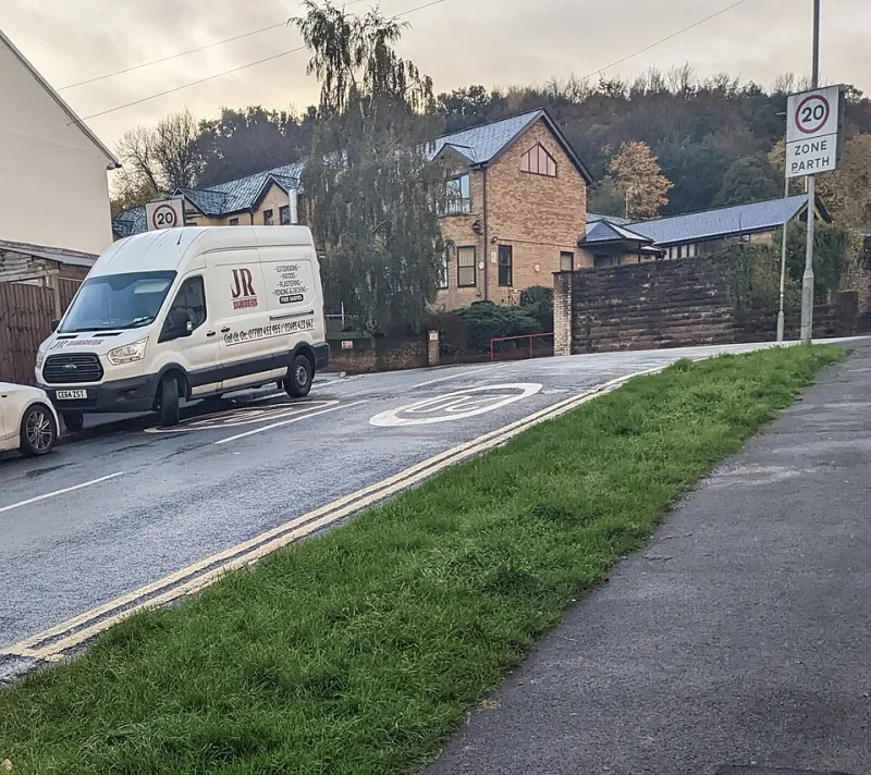
Photo: Jaggery , CC BY-SA 2.0, via Wikimedia Commons
Branding is not only the logo on your website. It is also the van in traffic, the box on a bakery counter, the invoice at the bottom of an email thread and the photo someone sees before they call you. These everyday assets are already on show. The question is whether they are doing useful work or just filling space.
The good news is that you do not need a full rebrand to make them better. Most of these fixes are cheap, practical and cumulative. Consistency beats complexity every time.
1. Van livery
For builders, mobile groomers, florists and delivery drivers, a van is a moving billboard. The mistake is treating it like a leaflet. You have about three seconds at traffic lights, so make the main message readable from ten metres away.
Design tips: keep one clear line of what you do, make the phone number large, use your brand colour on a plain white background rather than a full wrap, and do not cram every service into the side panel. Remember the rear doors, because that is what people see in a queue. If you lease the vehicle, magnetic signs or removable vinyl can work as a budget option. Keep the van clean and make sure your workwear matches it. A scruffy van tells a different story than a scruffy but consistent one.
2. Packaging
Bakery boxes, candle wraps, takeaway bags and online order parcels are all tiny stages. You do not need custom-printed everything. A rubber stamp, a coloured sticker or a strip of tissue paper can create a recognisable moment for a few pounds.
Design tips: pick one colour and use it across boxes, tape and cards. Add a short thank-you line and your website. If you sell food, make sure the packaging is suitable for the job before you get creative. For online sellers, a simple card with a referral sentence is often more useful than a glossy catalogue. The goal is not to be extravagant; it is to be recognisable when the box is opened on a kitchen table.
3. Invoices
Invoices feel boring because they are admin. But they are also one of the last things a customer sees after a job. For tradespeople especially, the invoice can be the difference between a professional finish and a rushed one.
Design tips: use the same logo and colours as the rest of your brand, keep payment terms clear, and add one short line describing what you do. Do not overdesign it. A clean header, readable type and a polite tone will do more than a decorative border. If you send invoices by email, make sure the PDF opens properly on a phone. Add a link to leave a review or a simple thank-you note. It is a small touch, but it keeps the relationship warm after the work is done.
4. Email signatures
Every email is a branding opportunity, even the quick ones. A messy signature with five logos, a quote and a giant image can make a small business look less considered than it is.
Design tips: keep it simple. Name, role, phone number, website and one line about who you help. Use a small logo if you have one, but do not let it dominate the screen. Check how it looks on a phone. If you are a limited company, include the details you are required to include. For everyone else, the test is simple: does this signature help someone contact you or understand what you do? If not, trim it.
5. Shop windows
A shop window is a landing page on the high street. It has to answer three questions quickly: what is this place, is it for me, and what do I do next?
Design tips: keep opening hours visible and accurate. Choose one main message rather than six laminated posters. Use vinyl lettering or a clean window decal instead of tape and blu tack. Make sure the glass is clean and the lighting works in the evening. If you have a menu, price list or booking information, make it readable from outside. A deli in Norfolk does not need a neon sign; it needs a window that tells you it sells good sandwiches and is open for lunch. Consistency with your website colours helps people trust that they have found the right place.
6. Uniforms
Uniforms are branding in motion. They appear in customers' photos, in doorways and on social media. They also help customers identify staff in a busy space.
Design tips: pick one logo placement and stick to it. Choose garments that staff will actually wear and that suit the work. Embroidery can look smarter for client-facing roles; print can be fine for casual settings. You do not need a full uniform. A branded apron, fleece or T-shirt can be enough. Match the colour to your van or shop front if you have one. Comfort matters more than a perfect photo; unhappy staff in scratchy polo shirts are not a brand asset.
7. Google Business Profile photos
For many UK small businesses, the Google listing is the first real impression. Photos often do more work than the description because people scan them before they read.
Design tips: use real photos, not stock images. Include the exterior with clear signage, the interior, the team and examples of work. For service businesses, before-and-after shots are useful if they are honest and tidy. Take photos in daylight, clear the foreground, and update them when the seasons change. Make sure your opening hours and phone number are correct. A good photo set says 'we are real, we are nearby, and we know what we are doing' without a single tagline.
The consistency rule
You do not have to fix all seven assets at once. Pick three that customers see most often, then apply the same logo, colour and one-sentence description. The aim is not to look corporate. The aim is to look like the same business wherever someone meets you.
A useful rule: if an asset leaves your building, it should answer what you do and how to reach you. That applies to a van, a box, an invoice and an email signature. Make it stand out through repetition, not volume.