What Your Brand Looks Like From the Bus Stop
There's a particular kind of disappointment that comes from designing a logo on a big monitor, loving it, then driving past your own premises a week later and realising you can't read a word of it. The van's parked in front, the light's flat, and your lovely sage-green wordmark has quietly turned into a grey smudge.
That's the gap we're going to close here. Not with a rebrand, and definitely not with a lecture about kerning. Just a walk up your own street, a squint, and a few honest notes.
The problem with arm's length
Almost every brand decision in a small business gets made at 50cm. You're at the kitchen table with a laptop, or in a print shop holding a sample, or leaning over a phone. At that range, everything looks fine. Of course it does — that's the range it was designed for.
Your customers, meanwhile, are seeing you at something between four metres and forty. They're across the road, half a carriageway away, behind a rain-streaked window on the number 43, or glancing up from a car park pay-and-display machine. That's the real viewing distance, and it is unforgiving in a way a Canva preview never is.
It's worth saying plainly: a brand isn't what you approve on screen. It's what survives the trip.
Five distances worth actually testing
Before you change anything, go and look. Properly, in daylight, ideally on a grim Tuesday rather than the flattering afternoon you'd choose for a photo.
The bus stop. Stand where the queue stands. Can you tell what the business does without reading every letter?
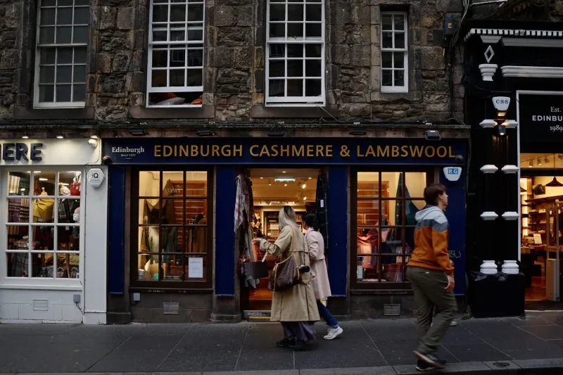
The opposite pavement. Cross the road and look back. This is where most signage fails, because it's far enough for details to vanish and close enough for awkwardness to show.
The drive-by. Get someone to drive you past at 20mph, or walk briskly past at the same pace. You get roughly three seconds. What landed?
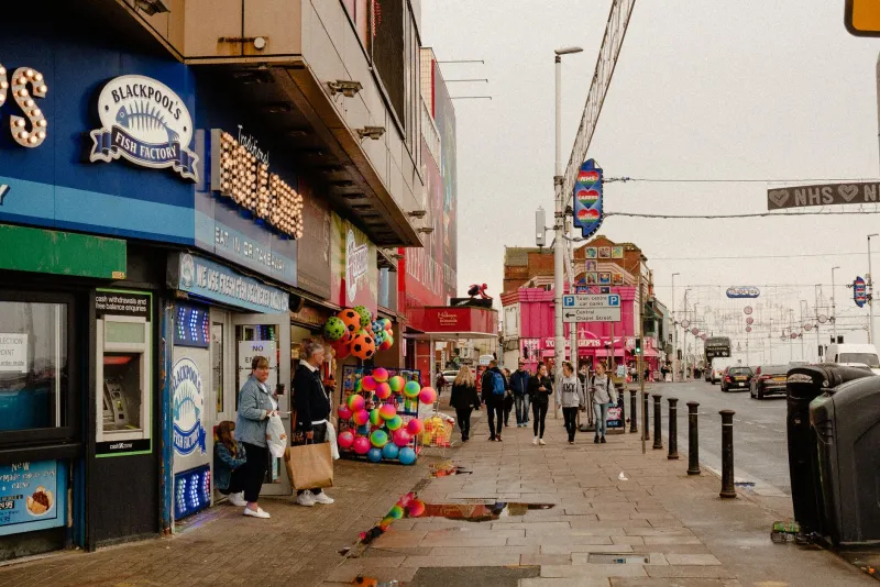
The retail park car park. A different sort of distance — not just far, but cluttered. Can your brand hold its own next to a Screwfix and a Costa sign?
The thumbnail. The cruelest one. Search your business name on your phone, in Google Maps, and look at the tiny square and pin label. That's how a decent slice of people first encounter you now, and it's a distance most owners have never once checked.
What survives a squint
Once you've done the walk, you start to notice a pattern. The things that survive distance are almost embarrassingly basic.
One thing, said clearly
At ten paces, nobody reads a strapline. They don't read a list of services, either. They catch a shape, a colour, and maybe three or four words. If your window says "Bespoke Joinery — Kitchens, Wardrobes, Staircases, Garden Rooms, Restoration & Repairs", the passer-by gets nothing. If it says "Joinery", they get it. The rest can live on the door, the website, and the leaflet.
Contrast, not taste
This is where good-looking brands come unstuck. Charcoal grey text on a mid-grey fascia is tasteful at arm's length and invisible at ten paces. The same goes for white lettering on pale stone, which is a very popular look on UK high streets and reads well in a portfolio, not so well in February light.
A rough rule worth borrowing from signage people: squint until the letters blur. If the sign becomes one flat blob of tone, you've got a contrast problem and no amount of clever typography will fix it.
Shapes over words
At speed, the eye reads silhouette before lettering. A distinctive shape — a strong icon, an unusual window arrangement, a bold colour block — does more work than a beautifully set wordmark nobody can parse from across the road.
The moving viewer is the default viewer
Here's the thing that arm's-length checks miss entirely: most people are not standing still. They're accelerating away from a roundabout, walking to a train with four minutes to spare, or scrolling with their thumb.
So test for movement, not just distance. Get a friend to film a ten-second clip from a passing car. Watch it back. Whatever registers in that clip is your brand. Everything else is decoration.
This is also why repetition beats cleverness. A single witty sign gets noticed once. The same colour, shape and short phrase appearing on the shopfront, the van, the sandwich board and the Maps listing builds something people recognise without consciously trying — which is the whole point.
The details that quietly evaporate
A few specific things that disappear faster than owners expect:
- Thin fonts at small sizes. Elegant script on a fascia becomes a wobble.
- Dropped phone numbers. Fine as design, useless as information.
- Colour on colour. Two mid-tones next to each other read as one from a distance.
- Photographs in windows. A busy image at ten paces reads as dirt on the glass.
- Small directional signs. If someone can't read it while walking towards you, it's a decoration.
None of these are design crimes. They're just decisions made at the wrong distance.
A ten-minute audit you can do this week
Grab your phone and a notebook. Walk out of your premises, or your market pitch, or wherever your brand is physically on show.
- Photograph your signage from the opposite pavement. Don't zoom.
- Film a slow walk-past. Watch it back at normal speed.
- Ask one person who doesn't work for you what the business does, based only on the photo.
- Check your Google Maps thumbnail and pin label on mobile data, not office wifi.
- Note every word you couldn't read and every colour that merged.
The results are usually a short list, and almost all of it is cheap to fix: bigger lettering, more contrast, fewer words, a clearer icon. Rarely a full redesign. That's the good news — distance problems are usually editing problems.
Then go back and look again
Brand building in a small UK business isn't really about producing beautiful assets. It's about making sure the thing you made still says something true when it's forty feet away and the viewer has somewhere else to be.
So before the next round of design decisions, do the walk. Stand at the bus stop. Squint. Then decide whether the thing you're about to change is a taste question or a legibility one. Nine times out of ten, it's the second, and the fix costs a lot less than a rebrand.