After the Tap: What Your Brand Looks Like in a Banking App

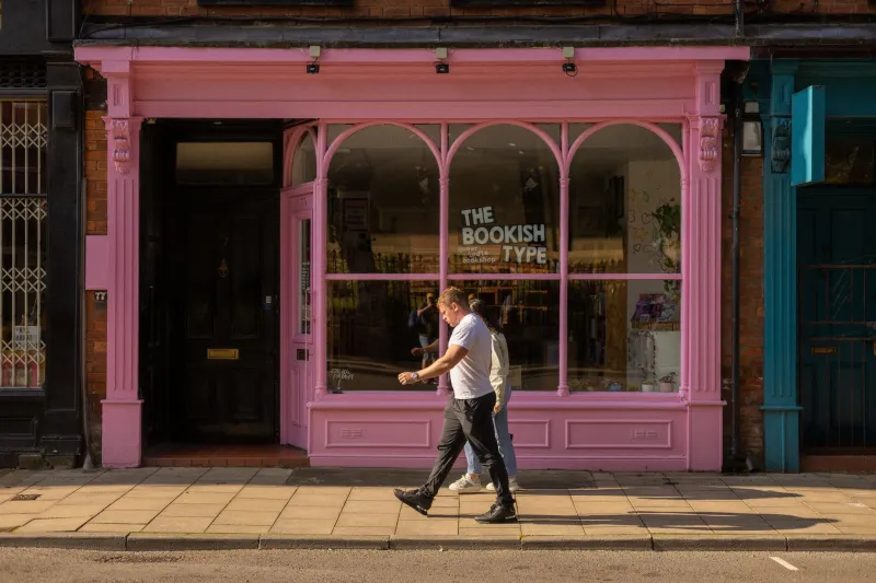
Photo by Photo by Swello on Unsplash on Unsplash
You know the moment. A customer taps their card, gets a receipt, walks off with the thing they bought. Then, two days later, they open their banking app and see a line item they do not recognise. It might say something like SQ *THEGREENROOM or PAYPAL *ABCDEF. They squint at it. They search their memory. Then they ring the bank, or worse, raise a dispute.
That line item is your payment descriptor. It is one of the few brand touchpoints that arrives after the sale, without your logo, your colours or your friendly member of staff. And for a lot of UK small firms, it is the only trace of the business in a customer's bank statement. So it is worth a proper look.
The bit of your brand nobody designs
Most small businesses spend hours on the shopfront, the website and the Instagram grid. Very few spend ten minutes on the string of characters that appears in someone's banking app. It feels technical, so it gets left to the payment provider or whoever set up the account three years ago.
But a payment descriptor is still brand identity. It is your name, or a version of it, doing a job in a place where people are already a little suspicious. Banking apps are where customers check whether something is legitimate. If the line item looks like a random code, their guard goes up. If it looks like the business they meant to pay, they relax.
Depending on the provider, you have got roughly 22 characters to work with, sometimes fewer once the acquirer adds its own prefix. That is not much. It is also enough to be clear.
Why it matters more than it looks
An unclear descriptor creates a specific kind of admin. Customers call to ask what the charge is. Staff spend time matching payments. Direct debit customers cancel because they do not recognise the name. Card customers raise chargebacks because they genuinely cannot place the transaction. None of this is malice. It is just a gap between what happened in the shop and what appeared on the statement.
There is a commercial point here too. A descriptor that matches your trading name makes you look organised. It says the business knows what it is called and has thought about the customer's experience after payment. That is quiet confidence. It does not need a slogan. It just needs to make sense.
Read your own statement like a stranger
The first step is simple: find out what actually appears. Not what you think appears. Not what is printed on the receipt. The actual line in a bank statement or card app.
Use a staff card for a small test payment, or ask your payment provider for the current descriptor. Check it on a phone, not just a desktop statement, because mobile banking apps often truncate the text. Ask someone who does not work in the business to look at it for three seconds and tell you what they think it is. If they say 'no idea', you have found your problem.
Do this for every way you take money. Card payments through Stripe, SumUp, Zettle or your bank's card machine may all have their own descriptor settings. Direct debits through GoCardless or a bank may show a service user number and a reference. PayPal and other wallets often add their own prefix. The customer does not care about your payment stack. They care that the line item looks familiar.
The four questions worth asking
First, does it start with the name customers know? If your registered company is different from your trading name, check what you are allowed to use. A descriptor that begins with a name nobody has seen before is doing you no favours.
Second, is it readable? Avoid strings of numbers, dates, order references and punctuation if you can. Those characters take up space and tell the customer nothing. You are not trying to be clever in 22 characters. You are trying to be recognisable.
Third, is it consistent? If your website, email signature, invoices and card machine all use one name, the descriptor should not introduce a new one. Consistency is the whole game. A customer should be able to join the dots without ringing you.
Fourth, is it honest? Do not make the descriptor look like a different business to dodge queries. That is a short-term trick with long-term consequences. The aim is clarity, not camouflage.
Make it recognisable without turning it into a billboard
You cannot fit your positioning statement into a bank statement. You can, however, fit the first word of your brand. Use the shortest version of your name that people actually say out loud. If you trade as Green Room Coffee, do not let the descriptor read as GR HOLDINGS LTD unless there is a legal reason you must. Check the rules with your provider, then use the clearest version permitted.
If you have several locations, decide whether the location needs to appear. Sometimes it helps. Sometimes it just eats characters. If your customers know you as one brand, the brand name probably does more work than the postcode.
Avoid symbols and decorative punctuation. They may look nice in a brand guidelines PDF, but they can render badly in a banking app. This is not the place for a custom typeface or a clever ampersand. It is the place for plain recognition.
Tell people what they will see
A good descriptor is supported by a sentence at checkout or in the confirmation email: 'Your statement will show GREENROOMCOFFEE.' That one line prevents a surprising number of queries. It also makes the brand feel joined-up. The customer is not left to work it out on a Tuesday morning when they are already late for something else.
If you use direct debits, put the expected descriptor in the sign-up confirmation and any reminder before the first payment. If you use a payment provider with its own prefix, say so. 'Your statement will show SQ *GREENROOM' is less elegant than your logo, but it is far more useful.
A ten-minute check for this week
Open your payment provider dashboard and find the descriptor field. Check it against the name on your website. Make a small test payment and look at it in a banking app. Ask a colleague or a friend outside the business what they think it means. Then update your checkout confirmation or receipt footer to tell customers what will appear. Put the agreed descriptor in your brand notes so the next person who sets up a payment method does not invent a new one.
That is it. No redesign. No new logo. Just one short line that follows the money and behaves itself.
Standing out is not only about the first impression. It is also about being recognisable when someone comes back to check. The bank statement is a strange little shopfront, but it is one your customers see. Make sure it has your name on it.