The Cardboard Handshake: A Packaging Check UK Shops Can Do This Week
A customer clicks buy, waits a day or two, then hears the knock. Before they reach the product, they meet the packaging. That parcel is the first physical handshake from your brand, and it happens in a hallway, on a doorstep or in a shared lobby. It is not the place for a grand gesture. It is the place for a deliberate one.
The good news is that a strong packaging brand moment rarely needs a bigger budget. It needs a sharper eye. Here is a practical check UK small retailers can run this week, using the parcels already going out of the door.
Start with what actually lands
Pull one parcel from each of your main order types. Open it the way a customer would. Not carefully, with a craft knife and the patience of a saint. Properly, with a thumb and a bit of impatience.
Check the basics first. Does the outer mailer or box arrive clean and intact? Is it wildly oversized for the contents? Is the product protected without a nest of plastic that would embarrass a pass-the-parcel champion? An oversized box is not generosity. It is noise, and it costs you in postage and materials.
Quick check: would you be pleased to receive this parcel if you had paid full price and waited four days? If the answer is a shrug, the packaging is not doing its job.
The tape tells a story, even when it says nothing
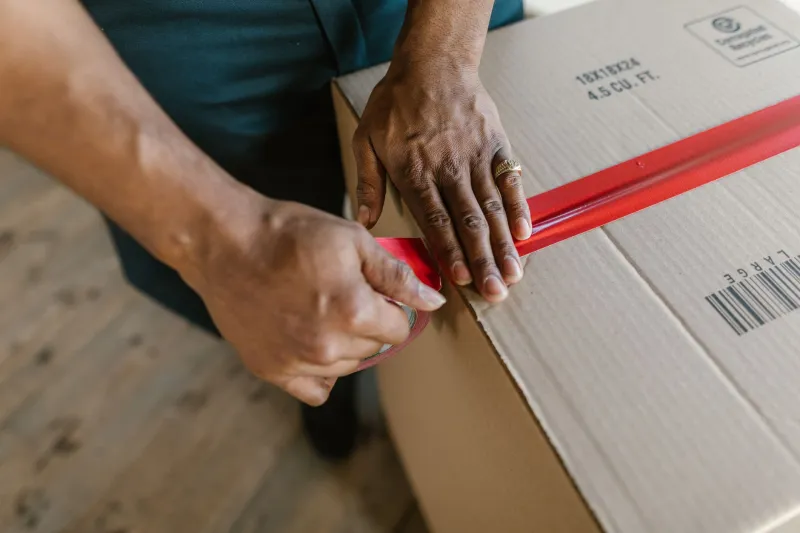
Tape is the cheapest branding decision in the parcel and one of the most visible. Branded tape is lovely, but plain tape with a well-placed sticker can work just as well. What does not work is a random mix of tape, half a logo covered by packing tape, or a box that looks like it was sealed during a mild emergency.
Aim for one clear tape style per order type. Keep your logo readable if it appears on tape. If you use paper tape, check it actually sticks in cold weather and on recycled board. A brand promise that peels off in transit is not a brand promise.
Quick check: can a customer tell this parcel came from you before they read the address label? They do not need a billboard. A small, consistent cue is enough.
The insert card is a ten-second billboard
Most insert cards try to do too much. They thank, sell, explain, apologise, invite and list social handles, all in a font that requires a squint. The customer is standing over an open box with one hand free. Give them one useful thing.
A good insert card does three jobs at most. It says thank you in your actual voice. It tells the customer what to do next, whether that is how to care for the item, how to use it, or who to contact if something is wrong. And it makes the next step easy, with a clear web address or QR code.
Check the details. Is the typeface the same one you use elsewhere? Are the colours close enough to your website that the card does not feel like it wandered in from another company? Is the contact email one that someone actually monitors? Is the spelling correct? These sound like small things because they are. Small things are what packaging is made of.
Quick check: if a customer pinned this card to a noticeboard, would it still make sense a week later?
Returns should not feel like a punishment
A returns slip is often the least loved piece of print in the parcel. It is also the one a worried customer reads most closely. Clarity beats charm here, but a little humanity helps.
Make sure the returns slip matches the policy on your website. Include the address, the timeframe, the condition requirements and a simple explanation of how to start a return. If you do not need a paper slip because returns are handled online, say so clearly on the insert card. Do not make people guess.
Tone matters. A returns slip that reads like a warning notice makes the whole brand feel brittle. A short, plain sentence such as 'Changed your mind? Here is how to send it back' does more for trust than a paragraph of legal phrasing.
Quick check: could someone who is not confident online follow the returns instructions without ringing you? If not, rewrite them.
The extras nobody asked for
Confetti, plastic filler, mystery samples and three flyers folded into a paper cube can feel festive for about four seconds. Then they become clutter. In a small UK flat with a recycling bin already full, they can tip a lovely unboxing into mild irritation.
That does not mean every extra is wrong. A relevant sample can be brilliant. A well-designed care guide can be kept. A discount card for a future order can work if it is genuinely useful and not an expired code printed in 2024. The test is simple: would a reasonable customer keep this, use this or recycle it easily? If the answer is none of those, it is not a brand touch. It is waste with your logo on it.
Quick check: remove one extra from your current parcel. Does the experience feel worse, or just lighter? Often it is the latter.
Consistency and clarity, without turning into a robot
Packaging does not need to match your website pixel for pixel. It does need to feel like it came from the same organisation. Check your logo placement, your main brand colour, your typeface and your tone. Are they recognisable across the box, tape, card and returns slip? Is your trading name the same as the one customers see online? Is the address correct?
Clarity is the quiet hero. Product names should match the order confirmation. Care instructions should be readable. Any QR code should go to the right page, not a generic homepage or a dead link. If you sell internationally, check that the customs information is accurate and easy to understand.
Quick check: hand a finished parcel to someone who does not work in your business. Ask them who sent it and what they should do next. If they hesitate, your packaging is asking too much of the customer.
Recyclability without the green sheen
UK customers are increasingly switched on about packaging waste, and local council rules vary. A bold '100% recyclable' claim is only useful if it is true in the place the parcel lands. Mixed materials, plastic tape on paper boxes and padded envelopes with layers can all complicate kerbside recycling.
Where you can, simplify. Use paper tape on paper board. Keep filler to one material. Avoid mixing compostable plastics with ordinary recycling unless your local service accepts them. If something needs to go to a supermarket collection point, say so on the card in plain English. Do not use vague green language to make a complicated parcel feel simpler than it is.
Quick check: can you explain in one sentence how the customer should dispose of the packaging? If not, neither can they.
A five-minute weekly habit
You do not need a packaging overhaul. You need a habit. Once a week, save one parcel from each order type. Open it, inspect it and note one thing to fix. Keep a simple standard: this is the box, this is the tape, this is the card, this is the returns line. Share it with whoever packs orders.
The parcel is the first handshake. It does not need to be lavish. It needs to be firm, clear and recognisably yours. Get that right and the product arrives with a head start.